Does Retail Sentiment Data have any predictive power for future price movements?
If so, what does it help you predict? Is Sentiment a contrarian indicator or does price more often follow the direction that retail predicted? How reliable are those predictions? Most important of all, is there any money to be made from using Retail Sentiment to influence your trading decisions?
These are the questions to which I want to find answers in this series of blog posts. I am going to put them under the microscope, in a purely data-driven way, and see whether the hypotheses can be confirmed or not. To do that, I am going to take you on a journey into the world of quantitative finance.
What Quantitative Finance is and Why you should care
Quantitative finance is a field of applied mathematics, concerned with the financial markets. To many of you that might not mean much, or you might even be put off by mathematics. But all it means really is that you form a hypothesis and put it to the test, using data and analytical methods. You let the data inform your decisions and take the guesswork out of finding profitable edges in the market. This is exactly the kind of thing you want for any strategy: have proof that it really is based on an edge and not just a flimsy idea that is going to lose your hard-earned money.
So let me take you along for the ride, walking you through the thought process and the conclusions we can draw from what we see. I'll explain everything in great detail, so you won't have any problems following along. In case you get stuck somewhere, just leave a comment at the bottom of the post and we can work it out together.
Step one: Exploratory Analysis
When doing any sort of Quant Analysis, you normally have a a certain goal in mind: You want to proof that your MACD indicator correlates with the price development of Forex Pairs, see if there is evidence that a Seasonal Pattern in USDJPY exists or simply validate the strategy a friend recently told you about. While it is important to have a goal for the analysis so we can stay on track, we should stay open-minded, question every result and not let bias creep up on us in order to prove the results that we secretly hope to find.
Our goal is simple: see if there are correlations between Retail Sentiment Data and price movements. If so, we want to define their nature more clearly and look for ways we can profitably exploit them.
For the analysis we are going to only focus on the major crosses containing USD. They are the most liquid and can be cheaply traded compared to some more exotic crosses. If there is any edge to Retail Sentiment, we are most likely to find it here.
The Sentiment Data we are going to use comprises the last 6 months. This is not much data in the world of Quant Finance, so we cannot take the results we are going to find to be the definitive answer to our questions. Relationships in the financial markets are highly dynamic and do change over time. So our results are going to give us a first clue about any potential relationships there currently are and we should repeat the analysis in regular intervals when more history is available.
Getting a feeling for the data
As scientific and data-driven as this process is, it is just as important to get a feeling for the data. When working with datasets this is important to be able to sanity-check results. Is what I am seeing plausible or are the numbers completely outside the realm of what is possible? We wouldn't be the first to find a sure-fire strategy that quadruples our equity every month... only to find out we have made a mistake somewhere in our analysis.
So the first analysis we are looking at is going to be to create a visual representation of how Sentiment Moves along with prices. Charts are an immensely powerful tool for any Quant Analysis, as they allow us to grasp relations more intuitively and easier than if we were to look at numbers only. A good chart says more than a 1000 words could ever describe.
Looking at Sentiment Quantiles
In order to create our visualization, we could just create two consecutive line charts: the top one showing a line chart of the close prices, the botom one a line chart of the Sentiment Data. But that would not be a good chart, now would it? Sure, you could get a rough idea of how price moves with Sentiment, but it would be hard to see at one glance where the important regions are (Sentiment being extremely long or short) and how Price moves in and around those areas. So I am going to do you one better.
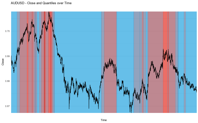
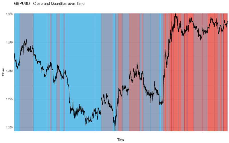
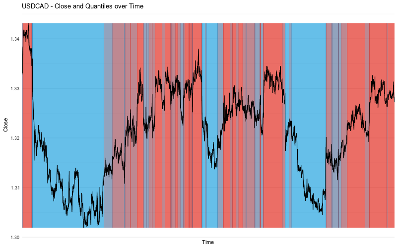
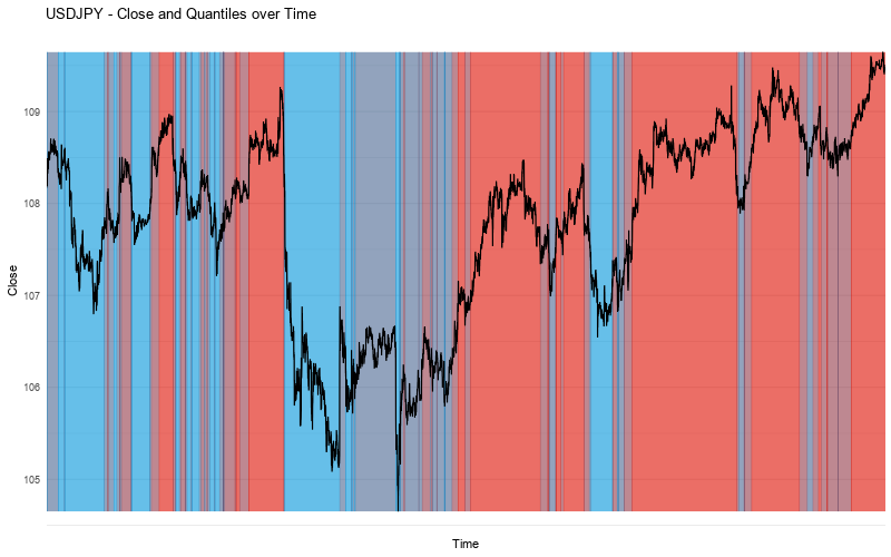
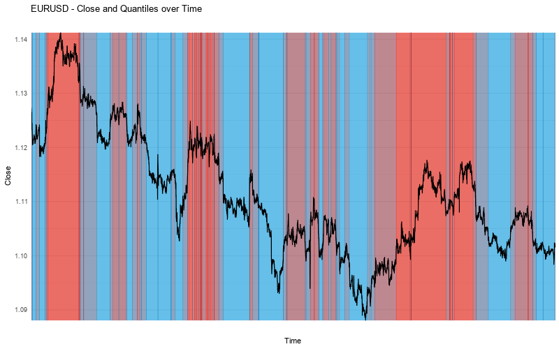
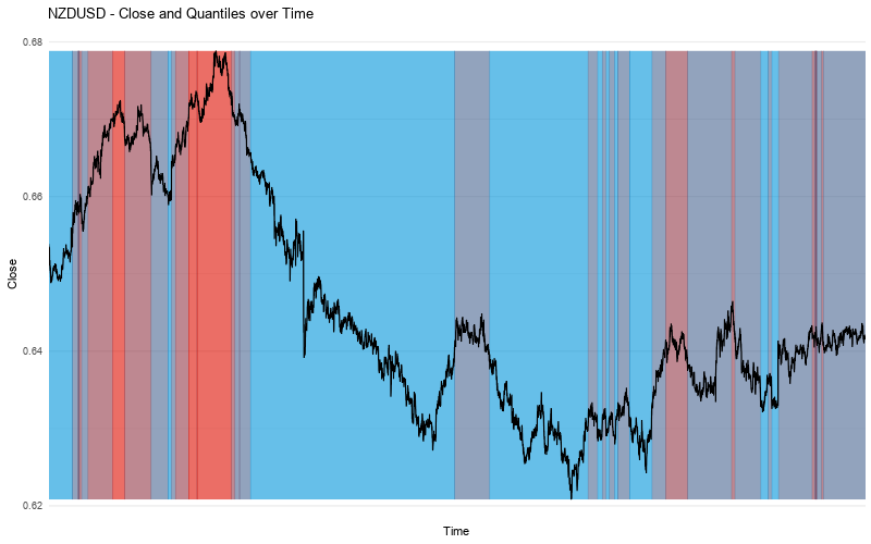
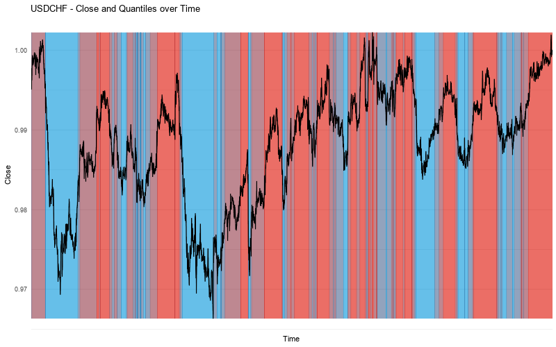
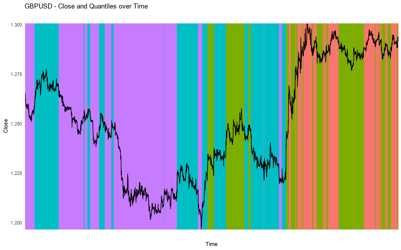
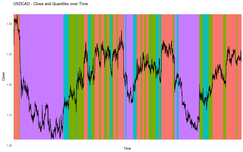
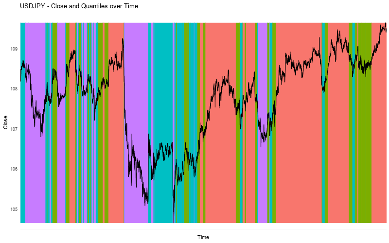
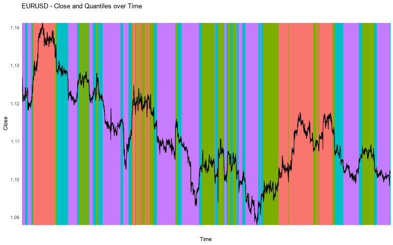
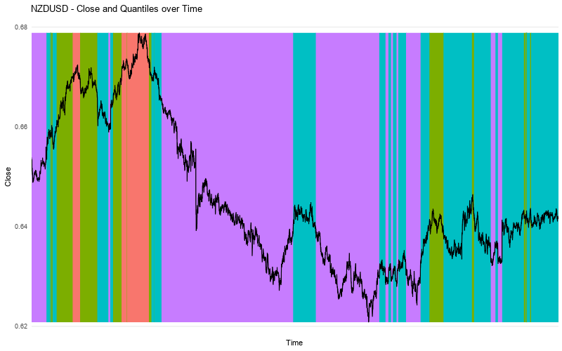
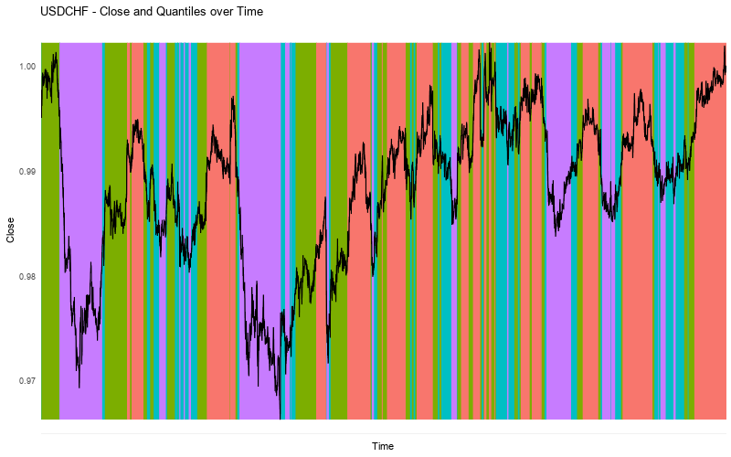
We are going to plot a line chart of the close prices and underlay them with a color, based on the quantile Sentiment was in at that time. But first we have to quickly discuss what the heck a quantile is. Simply put, quantiles are cut points dividing a range of numbers into multiple sub-ranges so that every sub-range contains the same amount of values. If we had the numbers 1 through 10 and divided them into 5 quantiles, the first quantile would contain the values 1 and 2, the second quantile would contain 3 and 4, and so forth until the fifth quantile which comprises 9 and 10. Quantiles allow us to quickly place a value into the context of the range of values we are looking at. So instead of looking at the Sentiment values directly, we will look at quantiles of Sentiment values. This allows us to focus on ranges of similar values and simplifies the chart: instead of needing 100 colors for every possible value, we can make do with 4 quantiles and 4 colors. The chart remains tidy and we can see more easily what is going on.
For all our analyses we are going to focus only on the Long Percentage, that is the percentage of retail traders which were long at the given point in time. That value already contains the information about how many percent were short, so no need to take that into consideration separately. Therefore we will deal with values in the range of 0 % to 100 %, showing the percentage of Retail Traders being long. We will divide that into four quantiles, so we end up with the following quantiles and their respective colors.

In the first quantile, 25 % or less of Retail Traders are long. In the fourth quantile, more than 75 % of Retail Traders are long. So the first quantile signifies an environment where the majority of Retail is short, the fourth quantile shows the majority of Retail is long. Those extreme areas are the ones we will look at most critically, as the extremes are usually where you see the most interesting behavior in statistics. But we'll see about whether that holds true for Sentiment values soon as well.
Sentiment Quantiles versus Price Movement
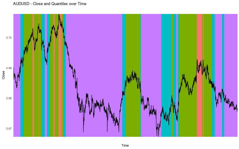
This is it, enough of the exposition, let's dig into what we came here for. Below you get the charts which I introduced you above: line charts of close prices, overlayed on a color-coded background according to the Sentiment Quantiles. Displayed are the last 6 months of the major USD crosses. Click on any chart to enlarge and have a closer look.
More accessible color scheme
Success so far and What Is Next
As you clearly see, this already looks immensely interesting. Just look at that large move down in AUDUSD and how Retail was more than 75 % long during that whole time. The same can be seen in GBPUSD, NZDUSD and USDCAD.
On the other hand we have large moves up in EURUSD and USDJPY where Sentiment stayed mostly short for the majority of the move.
So while this hardly constitutes quantitative proof yet, our exploratory analysis does show there is merit in digging deeper and looking more closely at the relationship between price movement and Retail Sentiment, as we are likely to find some exploitable correlations.
This is exactly what we are going to do in the next installment of our Quant Analysis. Until then stay tuned and use your newly won knowledge wisely.


Leave A Comment